Start with the feeling of the stay
We framed the identity around calm, air, and simple rituals. The design process focused on what the guest should sense before they can explain the brand.

Retreat / place brand
Saica Hut was shaped around quietness, simple living, and the feeling of stepping away from noise. The identity had to make a small stay feel intentional rather than improvised.

For a tiny retreat, the brand is not only a logo. It is the tone of arrival, the objects in the room, the way a guest remembers a morning, and the small signals that make the place feel cared for.
The main challenge was restraint. The brand needed to feel memorable without over-designing the experience or making the stay feel staged.
Saica Hut becomes a calmer, more memorable place brand with a system that can live across guest objects, atmosphere, and communication without becoming loud.
Process
We framed the identity around calm, air, and simple rituals. The design process focused on what the guest should sense before they can explain the brand.
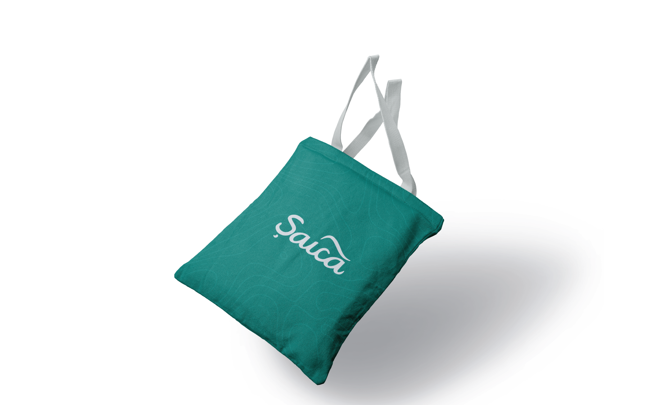
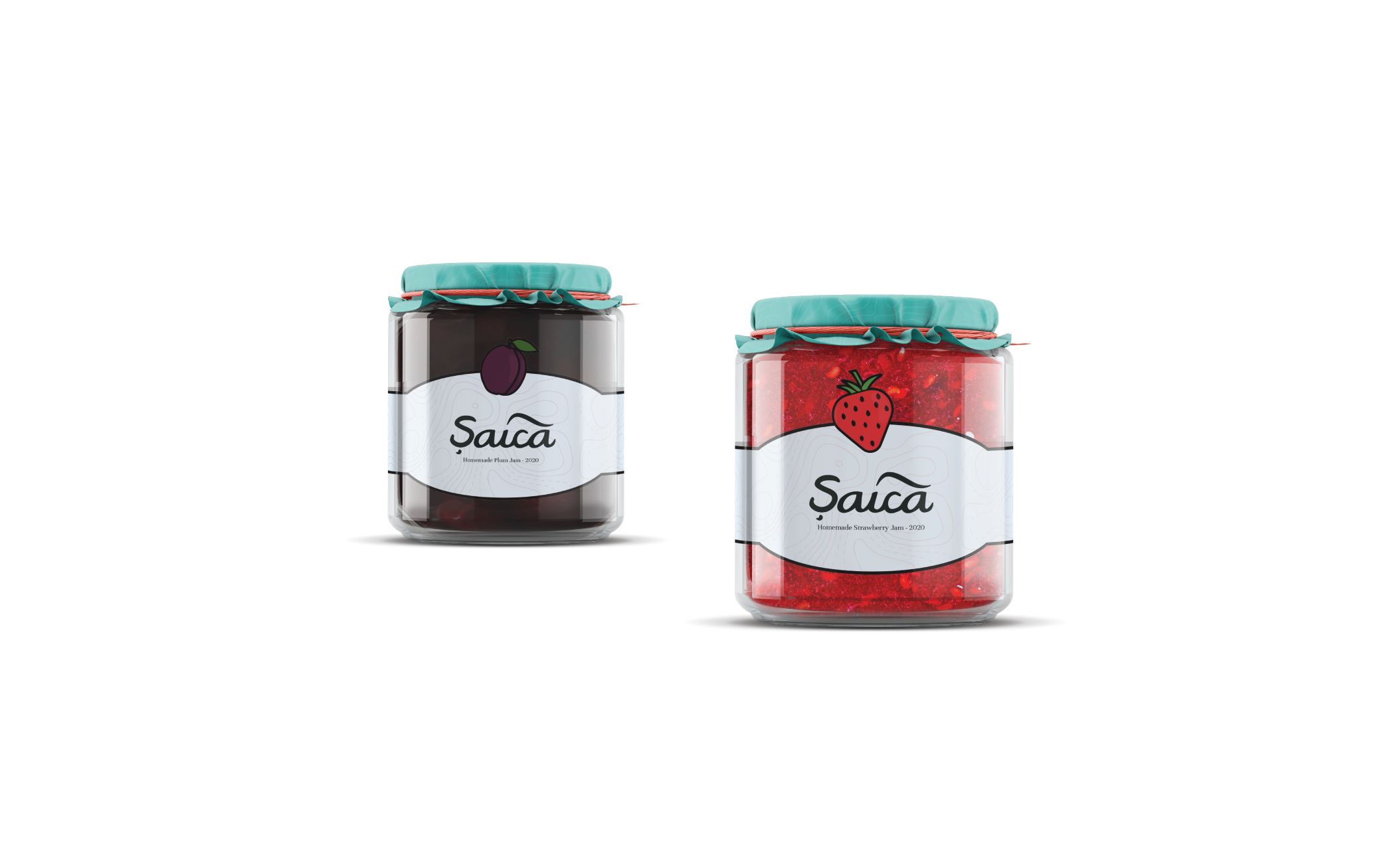
Bags, jars, guest materials, and small touchpoints were treated as carriers of the retreat's quiet point of view. The goal was to make practical objects feel part of the experience.
The system avoids heavy decoration. It uses space, softness, and natural cues to let the place remain the hero.

Design choices
The imagery and applications favor softness, fog, and texture because the brand needed to feel like a pause rather than an announcement.
Guest-facing items were designed as reminders of the stay. They are simple, useful, and restrained enough to feel natural in the space.
The identity supports the retreat instead of competing with it. This keeps the experience grounded in the landscape and the rituals of staying there.
Next project